Time:-
1 Week
Research:-
15 Hours
Design:-
10 Hours
Role:-
Product Designer, UX/ UI Designer,
User Experience Researcher
Prompt
A school wants to improve the upkeep of campus facilities by creating a new system for reporting any facilities that may need maintenance or repair. Design an experience that allows students to report building or equipment issues on campus. Consider the process of those filing the report and of those receiving and taking action on the issues.
For this project, I will be focusing on one of the many parts of the product, addressing the issues and requesting maintenance updates from the school authority, and staying updated on the maintenance issues until the problem is solved from the students' side.
Problem
Students have limited resources in the New York City College of Technology. There are never enough resources to accommodate the students' needs. And it never helps when things are broken or not working. Often when students and professors walk into the classroom they find the computer is not working or the smartboard is not responsive which causes a delay to start lessons and in worst-case scenarios, professors have to dismiss their classes because they are unable to continue with their lectures.
My goal in this design exercise is to identify and understand the different groups of people that are involved in this process of solving the problem and create a method of seamless communication between the responsible parties. This will make it easier for students and teachers to report maintenance issues directly to the team that is responsible for keeping the resources and technologies up to date
To determine success metrics:-
• The design should help the students and teachers to report their issues.
• The design should provide open communication and transparency ( confirmation, updates, etc.)
• The system must be user-friendly and easy to navigate (Seamless process).
• The system makes it easy for both parties to address the issues
Research
CUNY New York City College of Technology has a diverse body of students and faculty members. My target audience includes our students, faculty members, staff varies from tech-savvy Gen Z to boomers who are not as comfortable navigating around the internet. My main goal is to create a platform that will make the process of addressing the issue easier for everyone regardless of their knowledge of technology.
My initial thoughts and questions to supplement my research:
•Who are my target audiences?
•What does a system consist of?
•Where can I draw inspiration from?
•Talk to different users of varying products
•Shopping websites have similar services
•Virtual Doorman apps have similar services
•Clean and minimal Design
•What is the problem?
•What could be the potential solutions?
• Who are my competitors?
• What are their strengths?
•What are my competitors' weaknesses?
•What are the areas of opportunities?
•How can I address the issues my competitors failed to address?
Interviewing Students, Faculty members and staffs
My first step was to find participants in groups of students, teachers, and maintenance staff. Then I would create a form with a list of questionnaire that the participants could fill up online.
My questionnaire included questions such as:-
•What are your biggest frustrations?
•What is your opinion on current ways to getting things fixed and up to date when things are broken?
•What would you like to see in the design system?
Responses I've received:-
"I feel like there's a chain of command I have
to follow here in order to get anything fixed..."
— Amanda Lee (Student)
"I have to waste the first thirty minutes of class running around to get some help just get the computer and the smartboard running at least once every week."
— Anonymous (Professor)
"Most of the issues students and professors deals with are minor. It doesn't take a long time to fix these issues but there are a lot of miscommunications. You can't ask the genitors to fix the laptop and we can't ask the technical staff why the lights aren't working. Everyone here has specific responsibility which we solve those issues accordingly."
— Luis (Technical Staff)
Identifying Pain Points:-
Waste of time:- Students and teachers often has to waste their class time to get things working.
Miscommunication:- The tech staff often are assigned with specific tasks. Often they are being reached out to address an issue that does not fall under their umbrella of expertise. There are specific people assigned to deal with varieties of issues and students and teachers often don't know who is assigned to fix their issues when the issues occur.
Ambiguity:-Most participants expressed their frustration of not knowing who is the right person to reach out to solve their problem.
No Follow-Ups:- Even weeks after reporting issues, students have to come to class just to find out their reported issues are not resolved yet. Students and teachers are never sure if the right person was ever notified to solve the issue so they don't have to deal with that once they are back.
User Personas created to summarize the user scenarios:-
Persona 1

Hoya Yu (Student)
Hoya is a student at Citytech. She does not have an adobe software subscription. She gets most of her school works done in the computer lab where the students have access to a limited number of iMac computers.
Motivation
Hoya is motivated by her parents and her desire to become an art director. She is a perfectionist and prioritizes the quality of her work above all.
Frustration
Hoya's biggest frustration is not being able to get things done on time. Her time is very valuable to her and she hates waiting around when the computers are not available for work.
Persona 2

David Hamilton (Professor)
David is a part-time professor at Citytech. He is also a freelance graphic designer and often works for his clients during the time he is not teaching.
Motivation
David wants to make a difference in the world. He is very excited about being a teacher and creating the next generation of creatives.
Frustration
David's biggest frustration is not being able to follow through with his plans. He is a very organized person and hates it when his plans doesn't follow through.
Persona 3

Carl (Student)
Carl is a student at Citytech. He is a full-time student majoring in Dental Hygiene. He also works as a front desk receptionist at a doctor's office
Motivation
Carl is motivated by his daughter. He wants to give her a better future and become a better person
Frustration
Carl's biggest frustration is taking work at home. He wants to get things done on time so he can spend his time with his family.
Competitive Analysis
It is important to understand and research the competitors to understand what is it their strengths and weaknesses. This gives me room to create better designs and gather inspiration from their strengths.
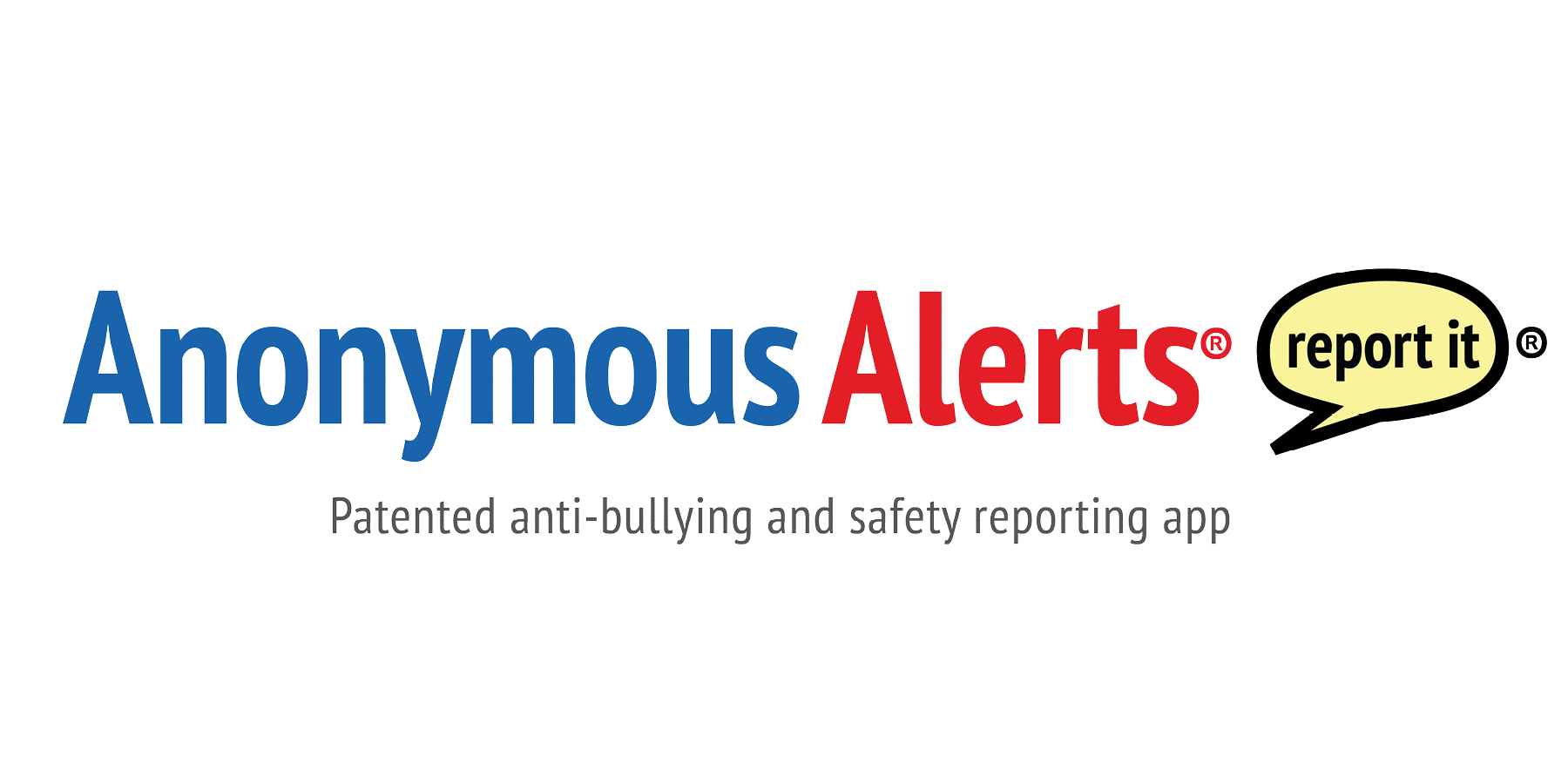
Anonymous Alerts:- Anonymous Alerts is an anti-bullying app that lets you report bullying, depression, drugs, and safety threats anonymously.
Strengths:- Anonymous Alerts provides their users with a code to sign up with which prevents outside students or entities' entrance.
Weakness:- The reports are made anonymously so there's no way to verify the issues or no trace left for the authorities to help students resolve their issues such as drug abuse and depression. Outdated user interface design
Monday.com:- Monday.com is a project management tool that enables organizations to manage tasks, projects, and teamwork.
Strengths:- Flexibility of updates for each item and personalize columns.
Weakness:- It takes more than a few clicks in or order to collapsing a group. Jammed packed with a lot of information which can be intimidating to new users

Slack:- Slack is a proprietary business communication platform developed by American software company Slack Technologies.
Strengths:- It is quick and has great seamless integration with other tools.
Weakness:- Unable to see old messages after 30 days.
Why an app?
One question I asked myself was why an app is the best solution to this problem. As young designers, we often look at app as the prime solution and forget about the pros and cons of having an app. Since my target audience is a vast group of people starting from young adults to senior citizens it is safe to assume that not everyone has access to a smartphone or lacks the knowledge of how to use one.
As a solution to this problem, I have also considered creating an emergency call line to complain, creating a website to report the issues and sending in notes to the Department's office. These options would have been much practical considering our older generation of users. However, those services already exist and it failed the students and teachers to get immediate results. One of my main concerns was to provide immediate result and instant updates about the issues to the users so they are aware of how their complaints are being handled. With phone and written complaints, there are never any follow-ups, automated documentation, or record of dialogue. Creating a website was also one of the considered options but that is also a virtual email-based system. Every time a user would want to check the update of their report they would have to go to the website and login where an app would send the users notifications with every update of the report. with that in mind, I approached this exercise mobile-first and also built for web in mind.
Design consideration
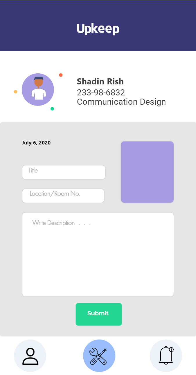
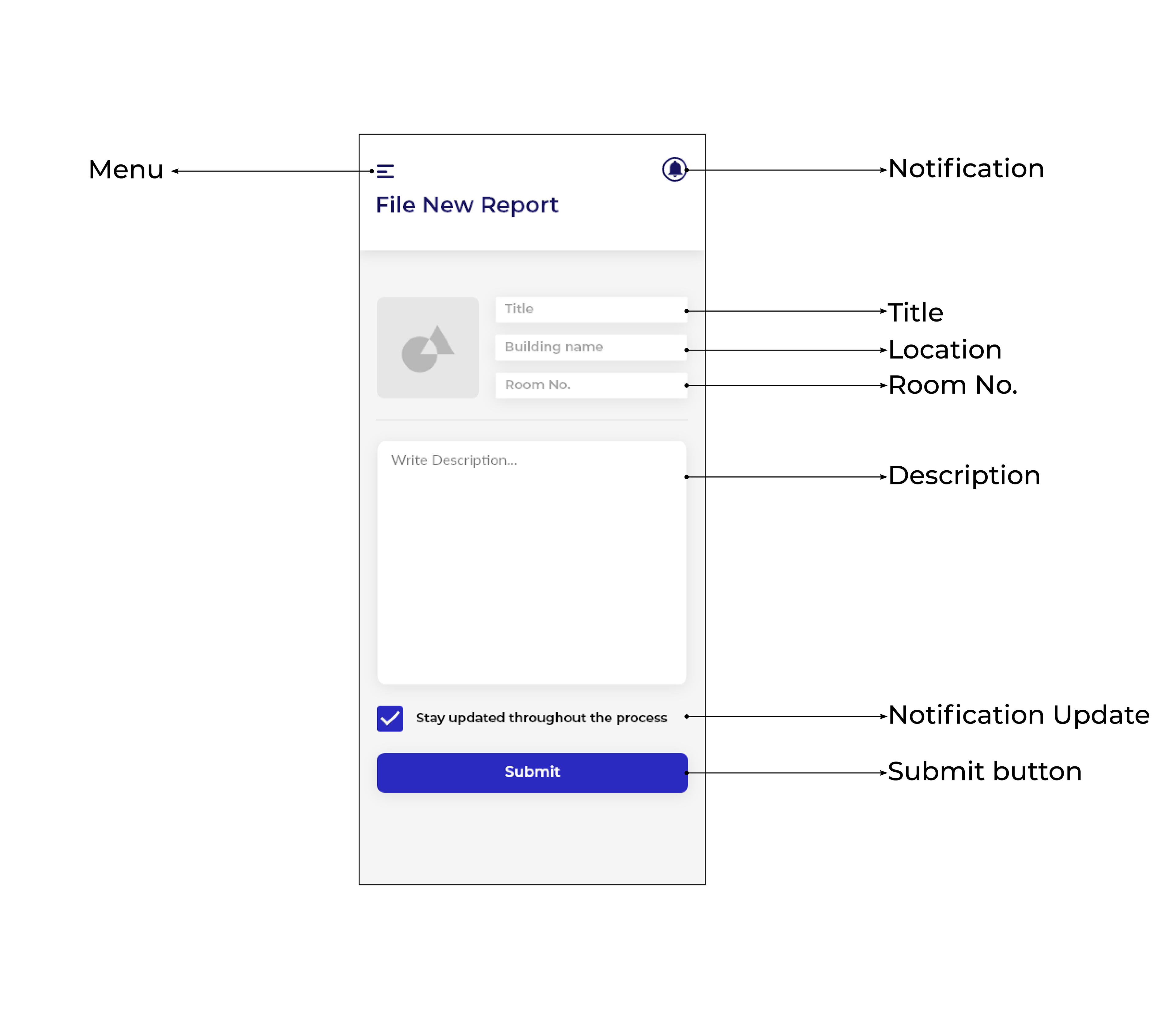
•Auto Generate Input will eliminate redundancy. Auto Generate Input feature will prevent users from typing in the same information every time they want to report an issue.
•Chatbot can streamline more urgent requests at needs. BUT in order to put it to use it will require additional staff and resources. Also, it will lack the human connection when our users would prefer to speak with a person.
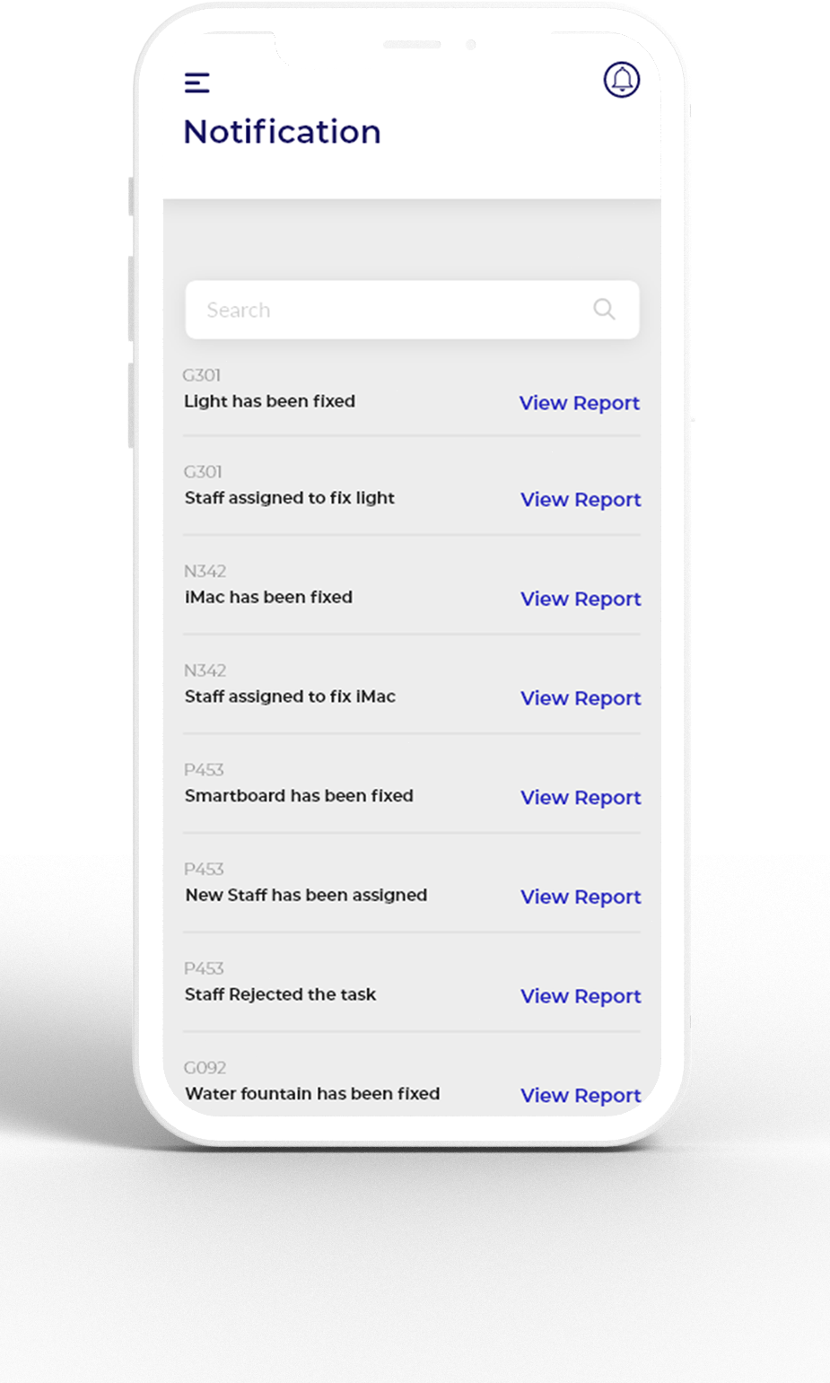
•Status, Update Alerts, Feedback will allow the users to understand and stay informed about their reported issues. I was inspired by online shopping platforms' feedback and update alerts and wanted to include these features.
•Accessibility would allow everyone to use and benefit from this design system equally. Voice assistance feature has been considered to make the system inclusive for everyone.
Using guidelines helps me design better systems. Below are ADA-compliant web design standards.
•Contrast Ratio
•Don’t Rely on Color
•Label Forms Clearly
•Provide Feedback for Errors and Omissions
•No Mouse, No Problem
•Keep Navigation Consistent
•Simple Headings and Spacing
•Design for Different Devices, Views, and Screens
•Offer Alternatives for Consuming Media
•Give Users Control
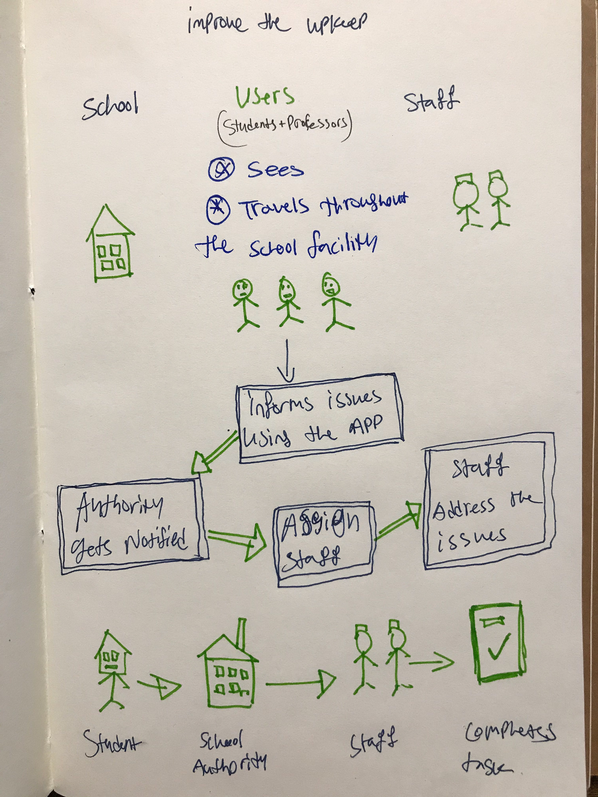
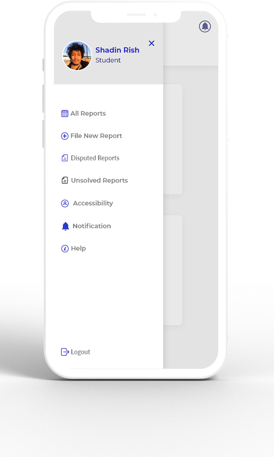
Ecosystem
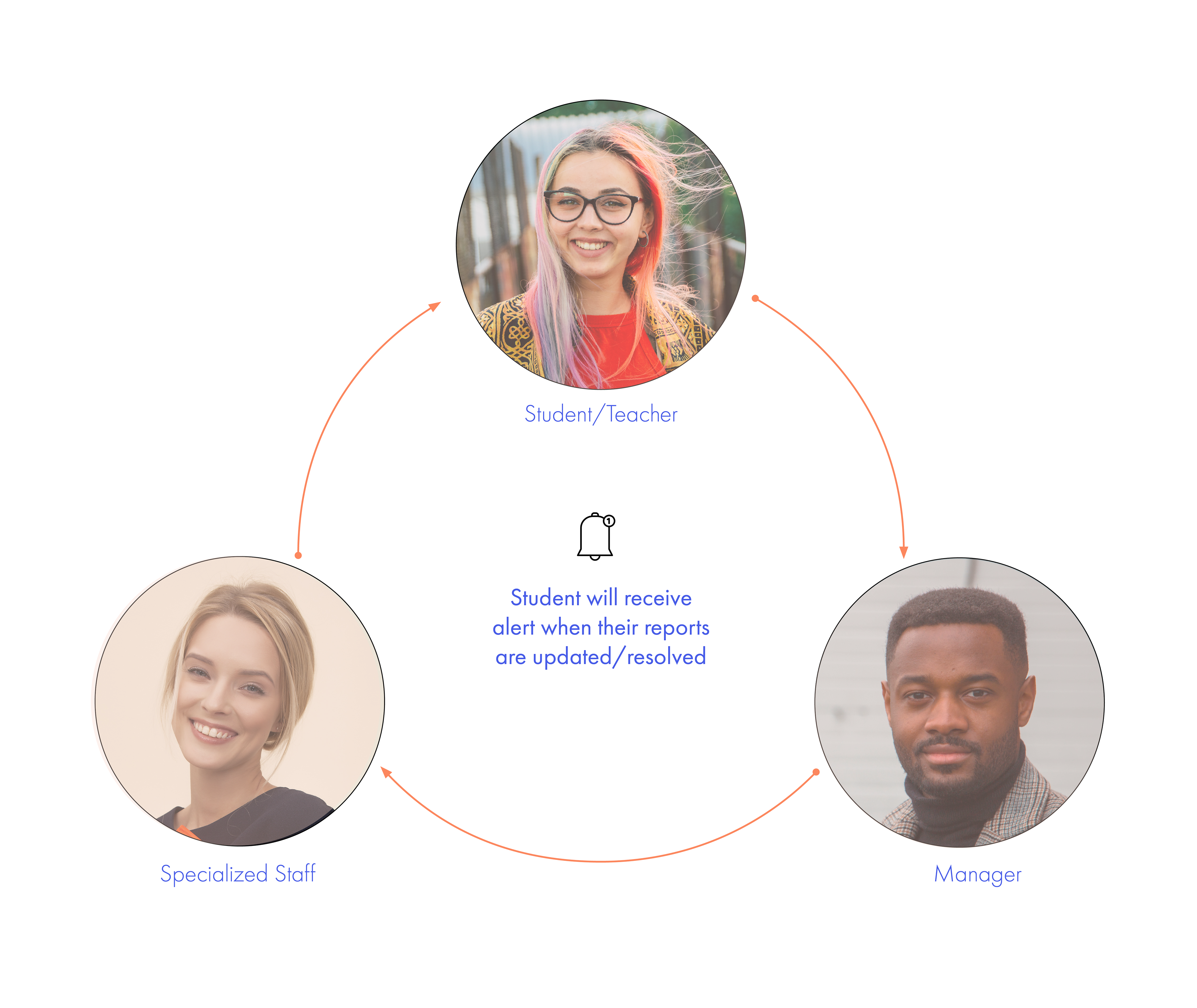
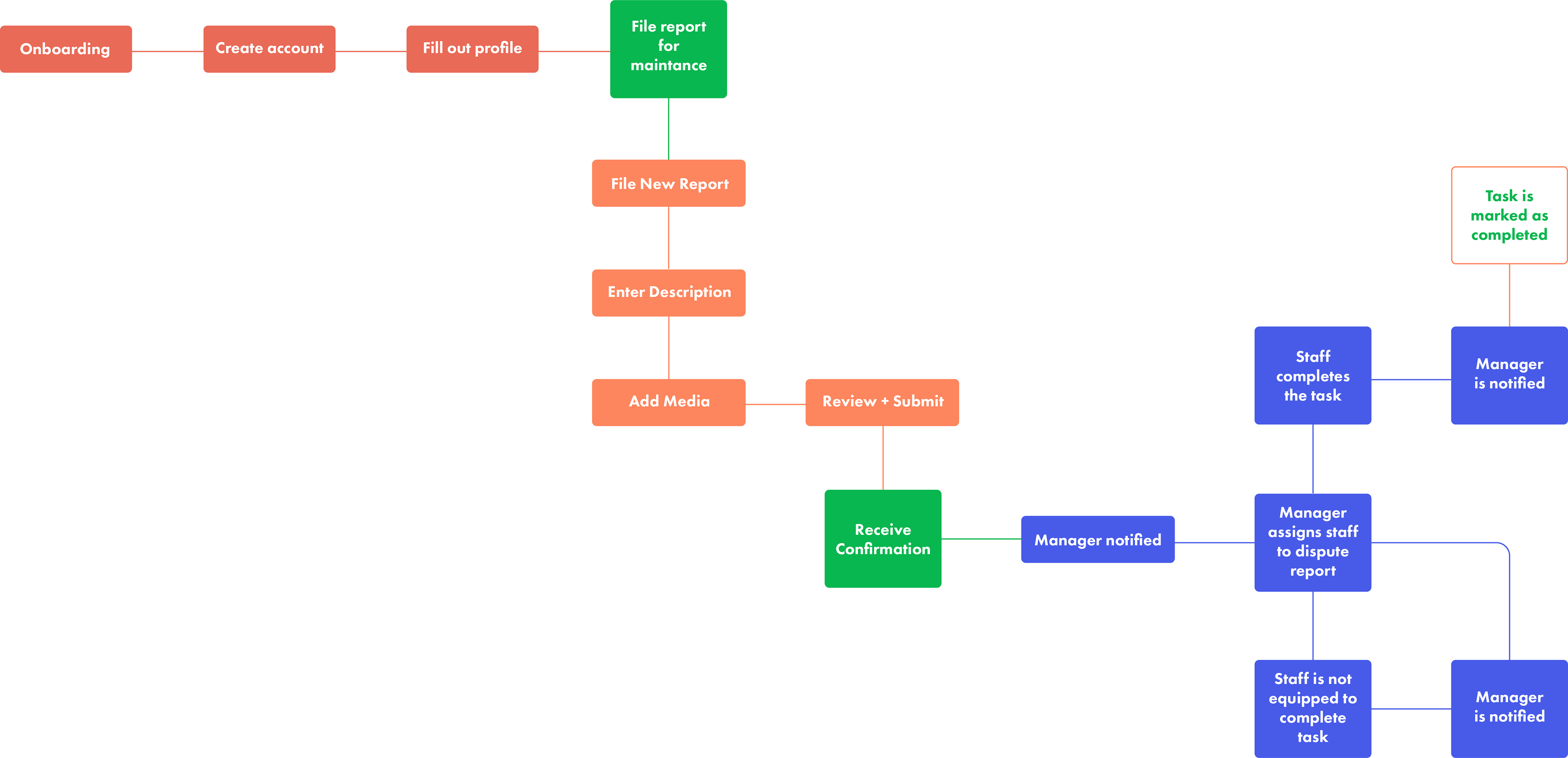
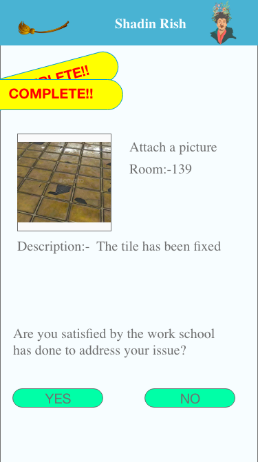
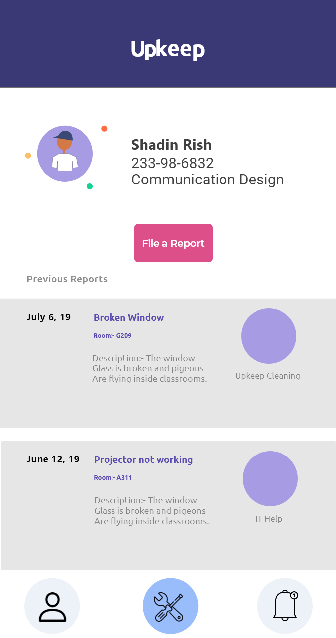
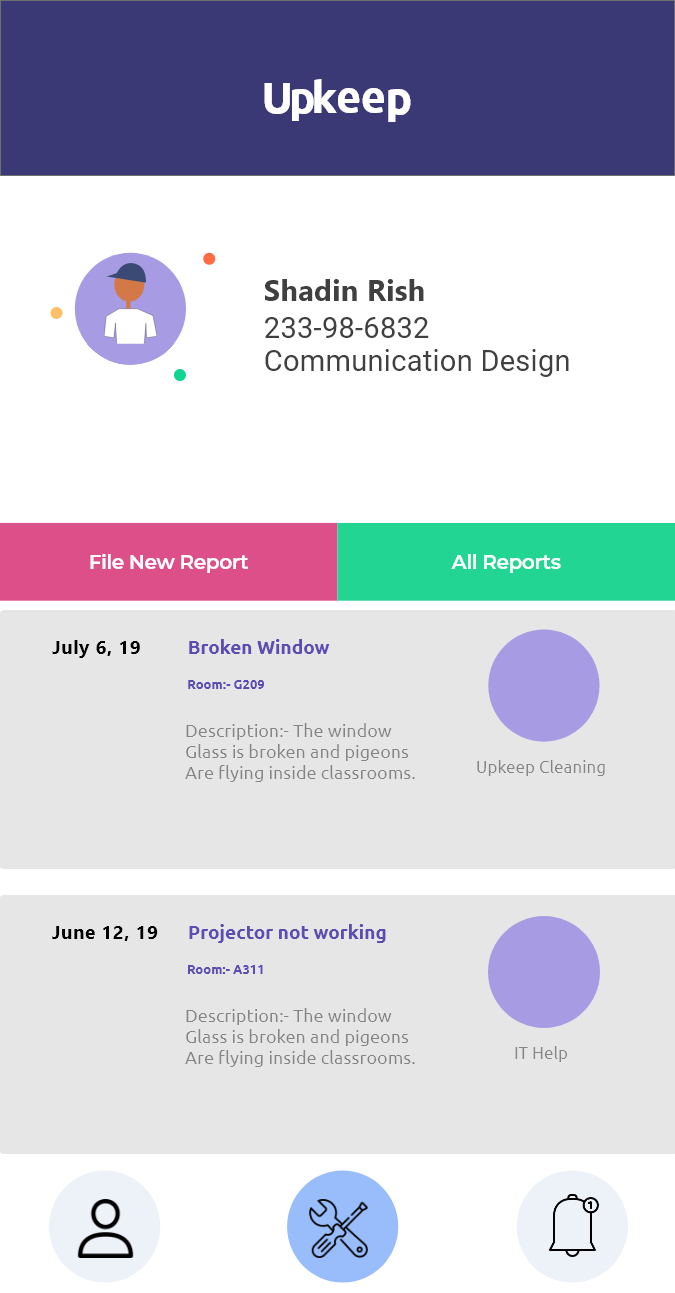
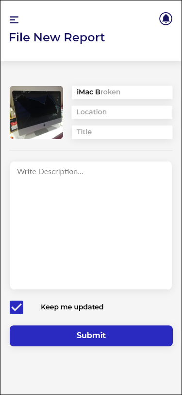
User's Role:- Users (Students/Teachers) will report an issue using the app where they will attach photos and a description of the incident. Once a user submits a report, the app will notify the maintenance manager who is in charge of all the maintenance staff.
Manager's Role:- Once the manager receives the report notification, he/she will assign the task to the staff appropriate for the role. Once a task is completed, the manager will be notified and he can mark the task as completed and notifies users .
Staff's Role:- Once the staff is assigned a task, he/she can address the situation. If the staff requires extra help or decides that they are not suitable for the job, the staff can inform the supervisor using the app.
Information Architecture
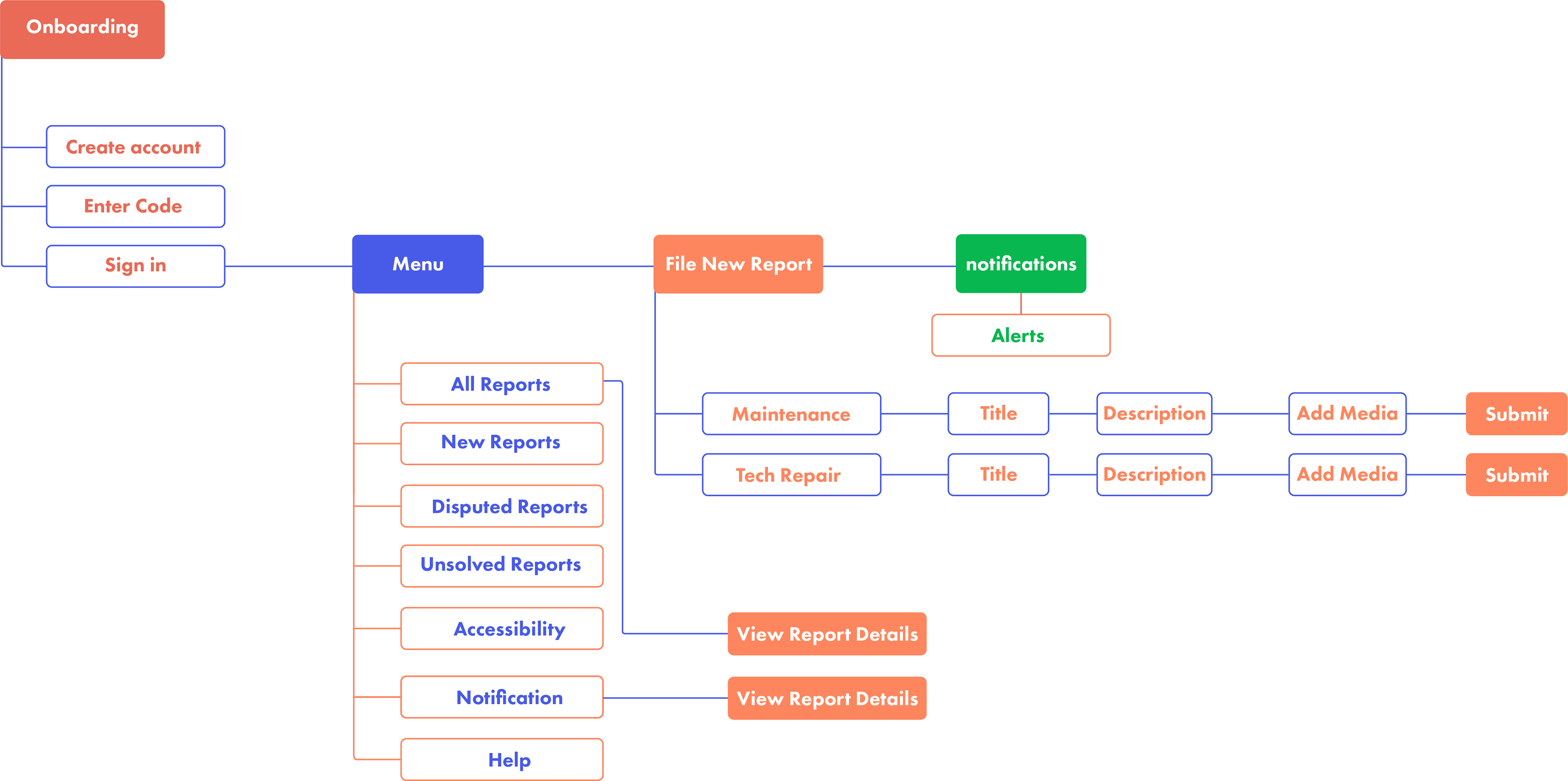
Task flow
Constraints
With the complexity of this project in mind, I had to recognize my limited time and focus on only one aspect of solving this issue. Therefore I chose to focus on designing the wireframe of the app for the users to file reports.
User Scenarios
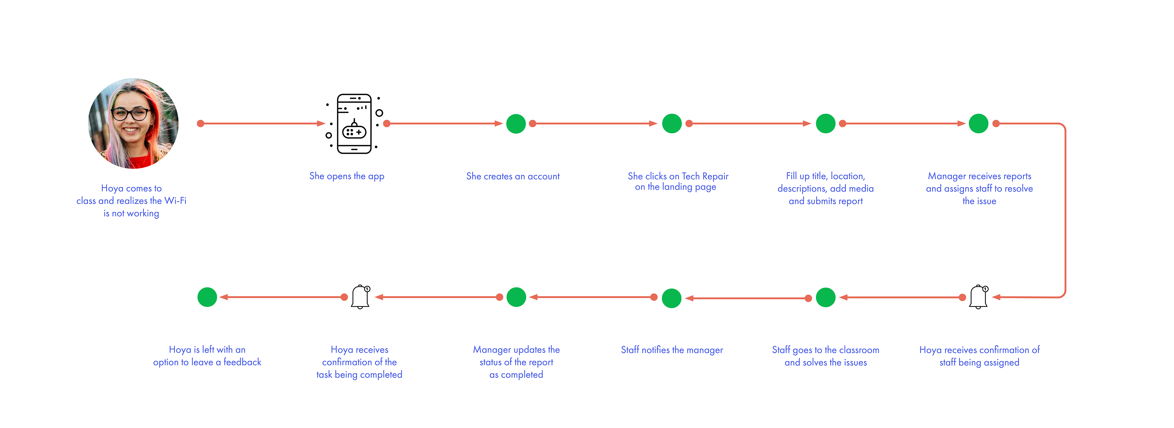
User Scenario 1
Let's bring Hoya back into the picture and use her persona in an effort to understand the design system in a user scenario. Hoya comes to class ten minutes early and realizes theWi-Fi is not working. She immediately takes out her phone and uses the app to file a report. The process of filing a report was quick and easy. Within a few minutes, the tech staff comes into the classroom and fixes the issue.
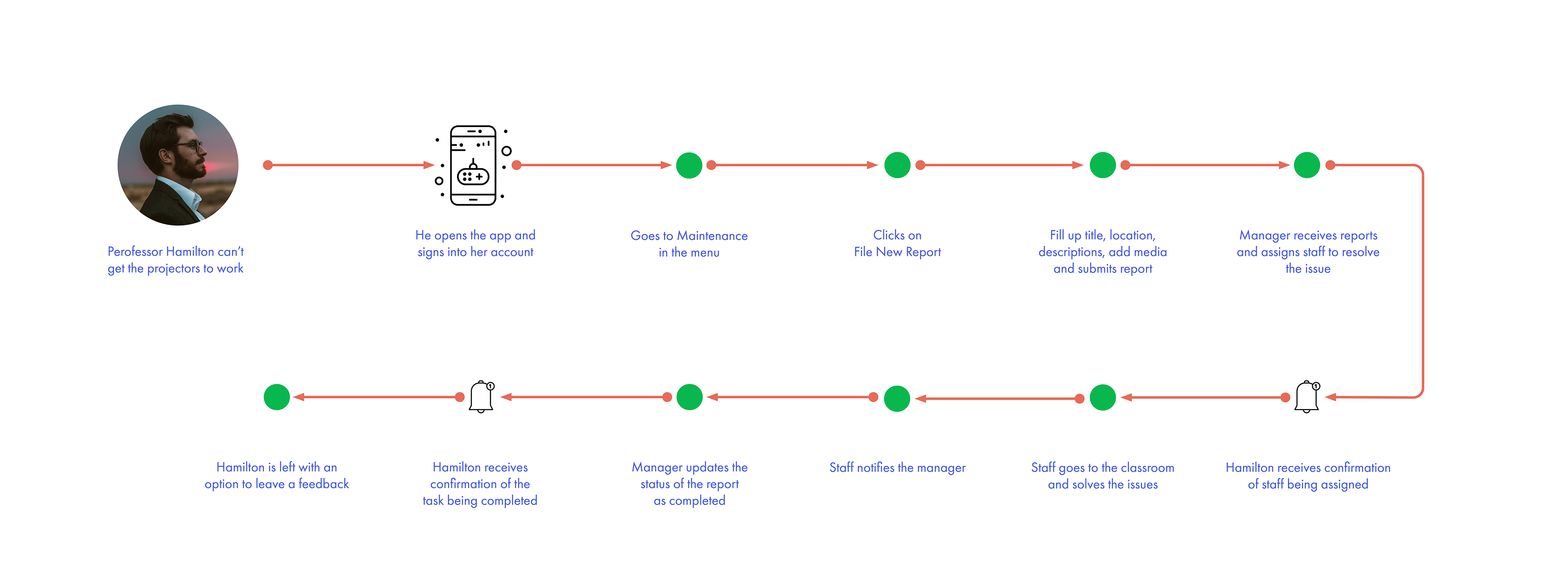
User Scenario 2
Professor Hamilton was lecturing his students about the history of photography and all of the sudden the electricity goes off. He takes out his phone and uses the app to file a report and sends his students to take ten minutes. A technical staff arrives immediately and resolves the issue within seven minutes.
Sketches
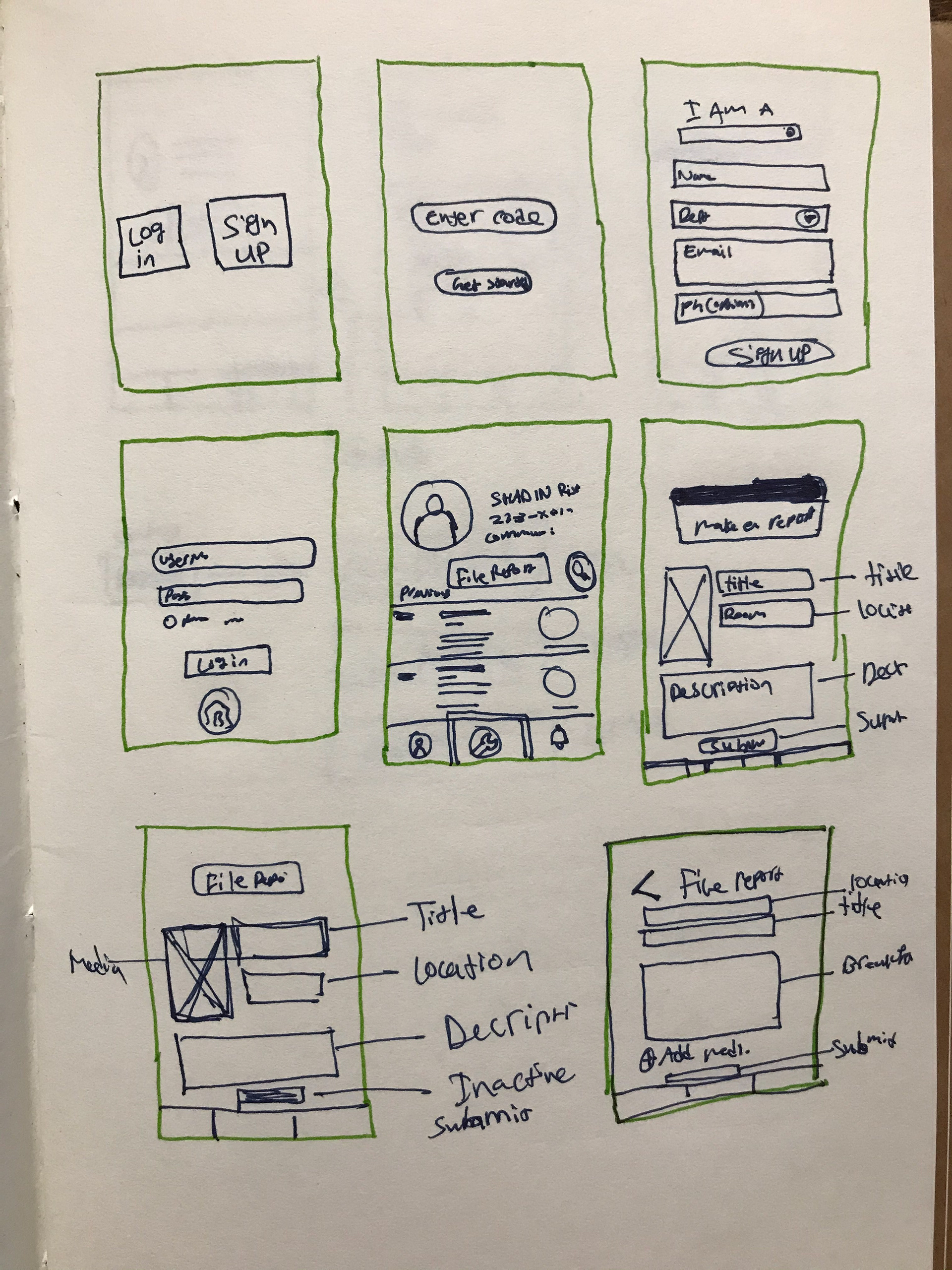
Wireframe of filing reports options
Option 1

Our target group includes users from Boomers to Gen Z. With that in mind, my first option was a bit more colorful and simple with a throwback style from 1990s website designs.
Pro: Simple. Easy to navigate. Throwback style
Con: Outdated designs. Not clean
Option 2
Option 2 designed by further developing the ideas from feedbacks that was received from user testing option 1.
Clean and simple interface. Main Buttons were and features were designed with accessibility in consideration
Pro: Clean interface. Easy to navigate
Con: Confusing buttons! Not clear hierarchy. Too many color.
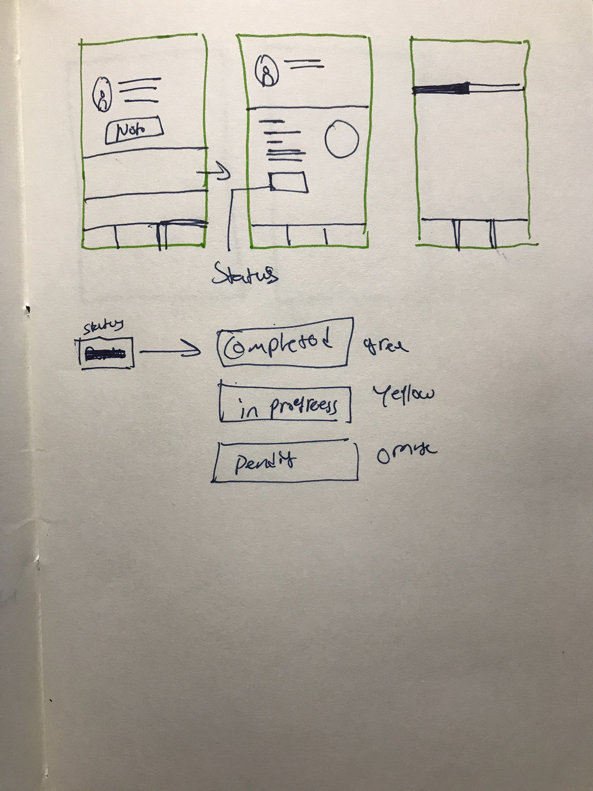
Option 3

Option 3 was built with the same concept in mind but with a much cleaner and presentable look. Main Buttons were and features were designed using assigned colors to create to be user-friendly and accessible to the users.
Pro: Clean interface. Easy to navigate
Con: No color. Blend. Accessibility issues with user with far sighted vision that depends on colors and shapes.
Option 4
Option 4 designed by further developing the ideas and the concept of option 1 and 2.
It is designed to create visual hierarchy, clean and simple interface. Main Buttons were and features were designed with accessibility in consideration
Pro: Clean interface. Easy to navigate
Con:
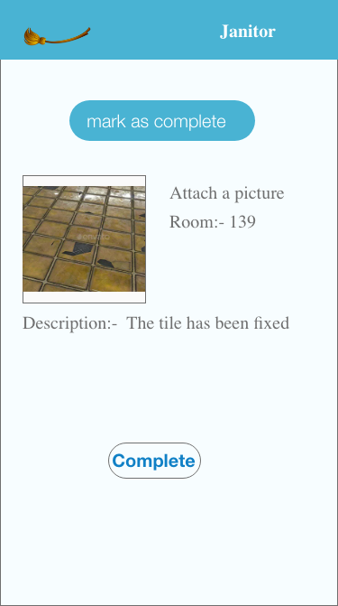
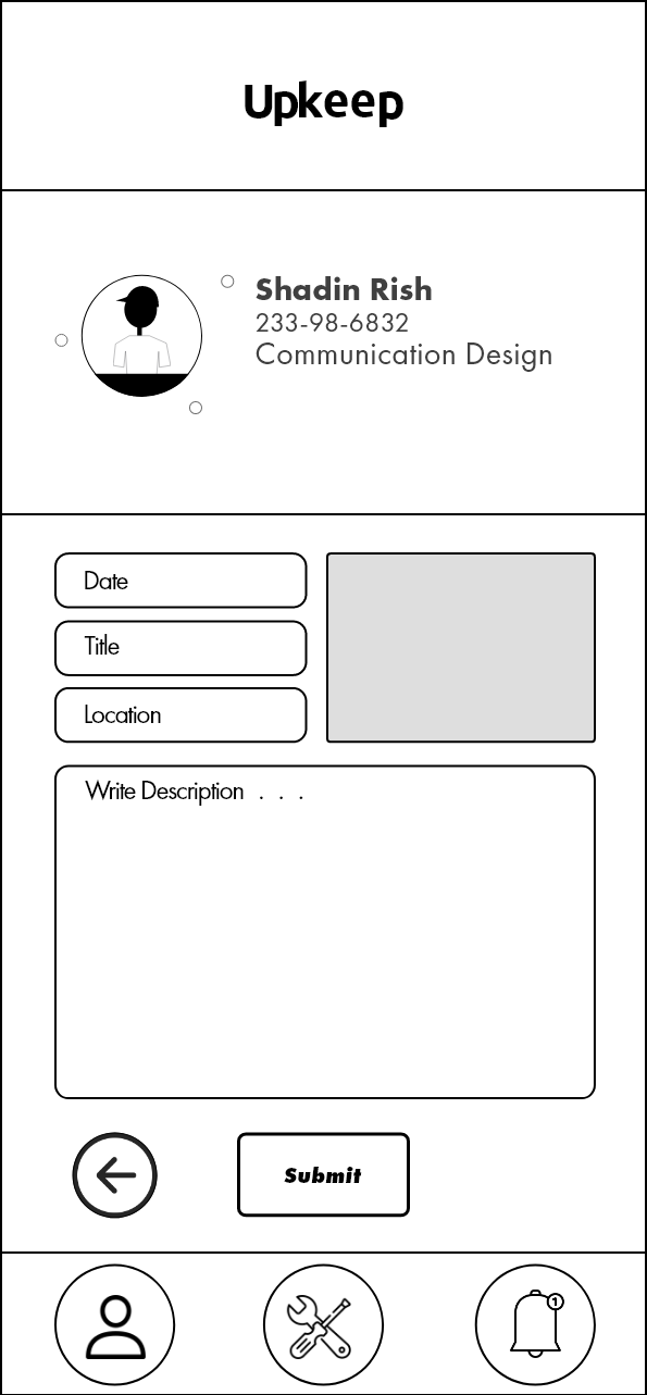
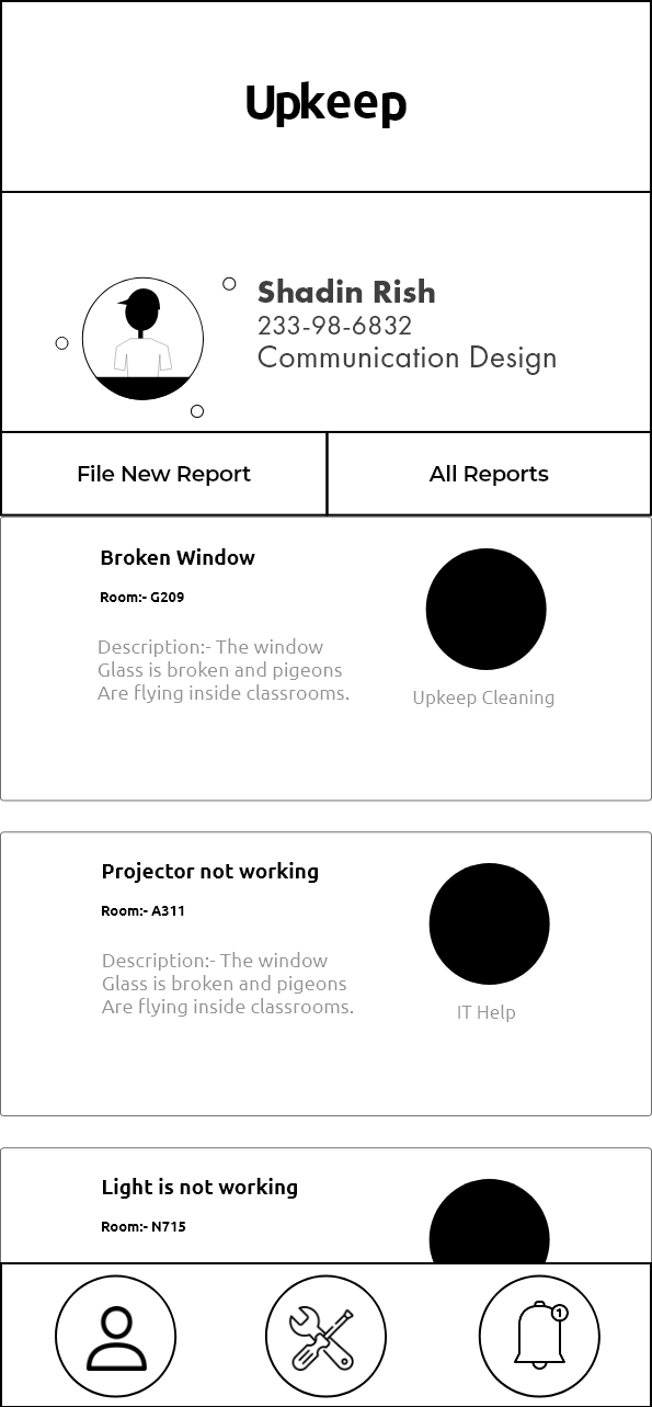
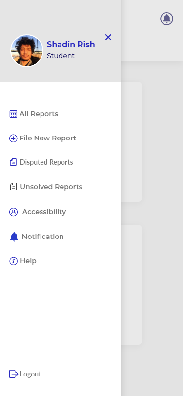
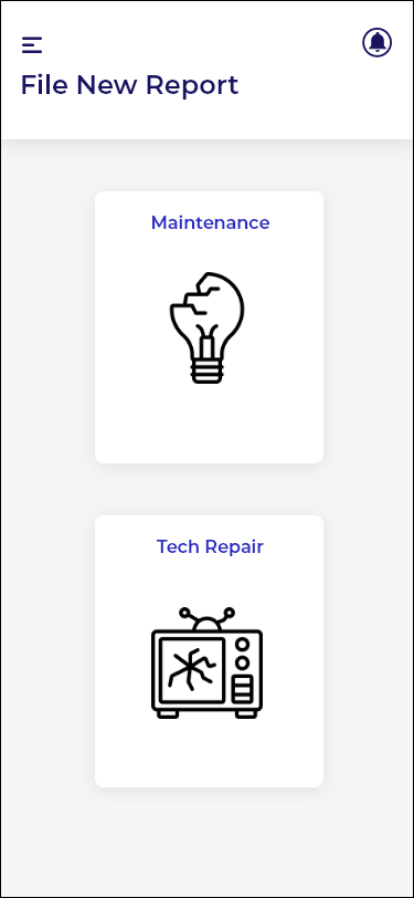
High Fidelity mocks of filing report process
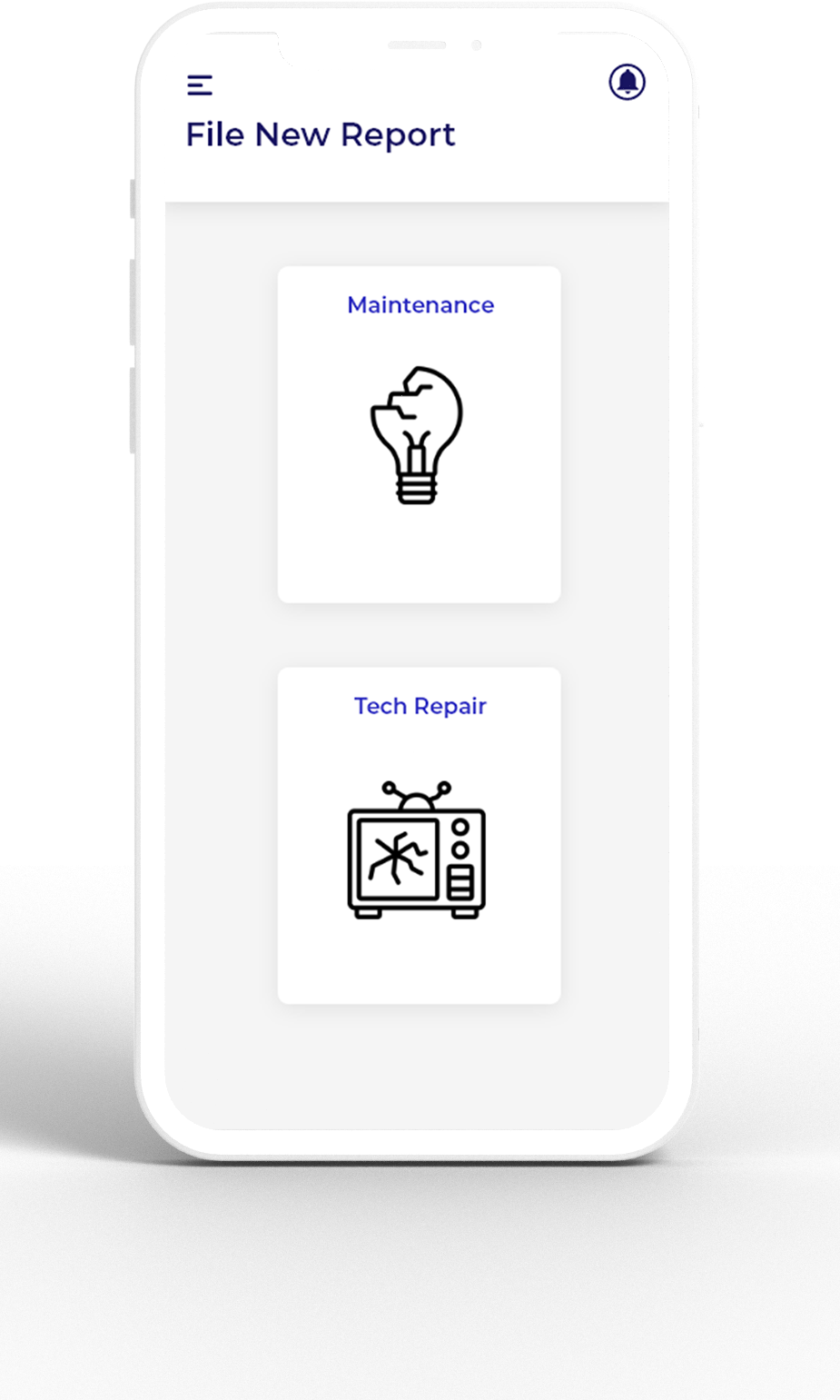
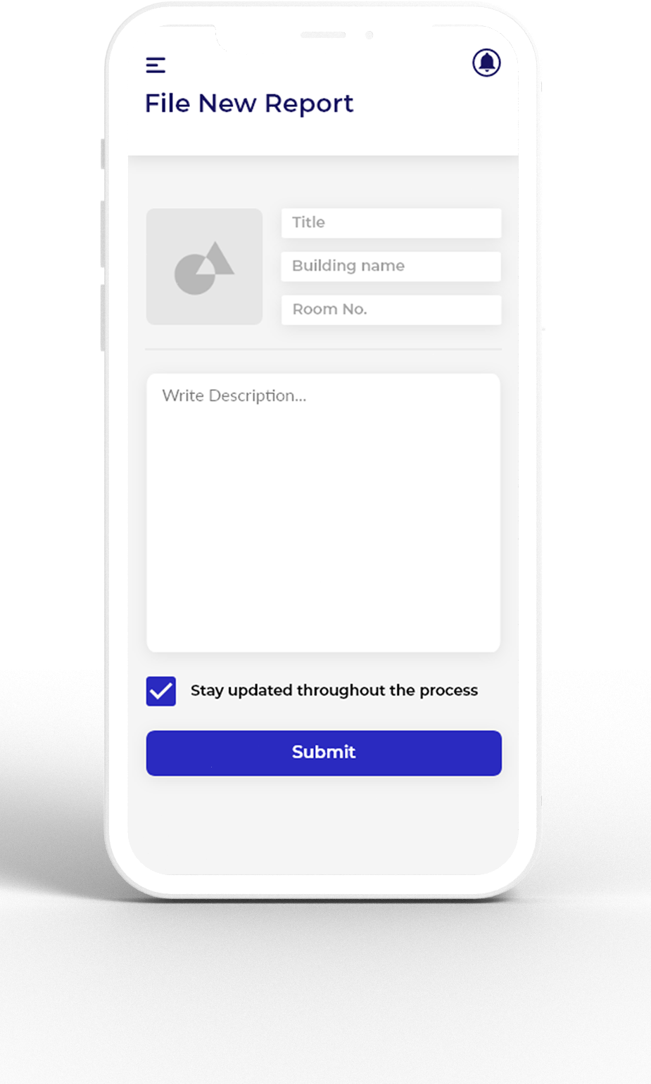
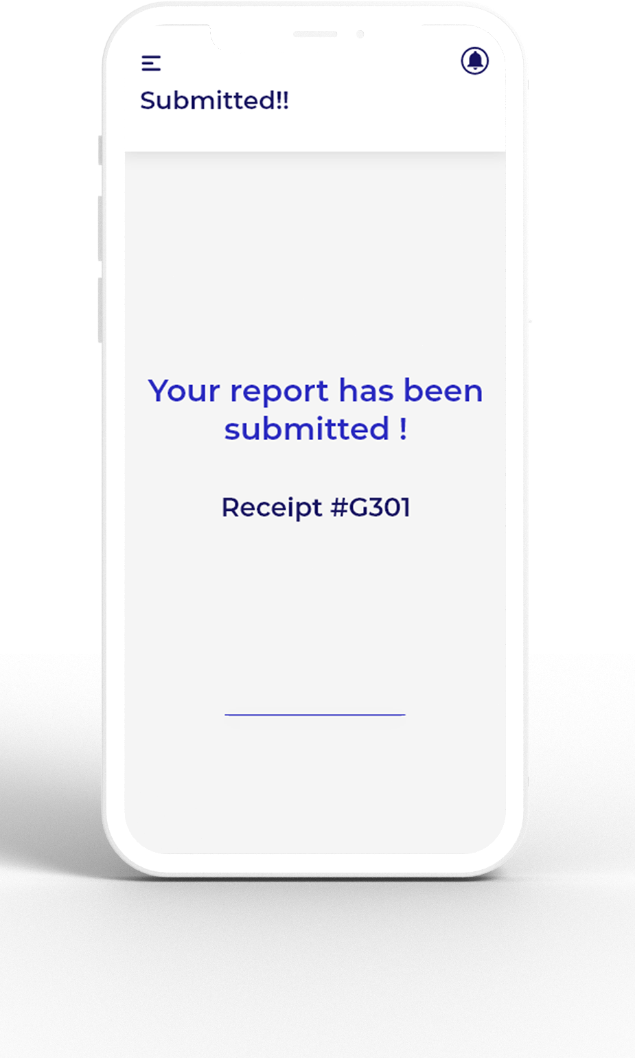
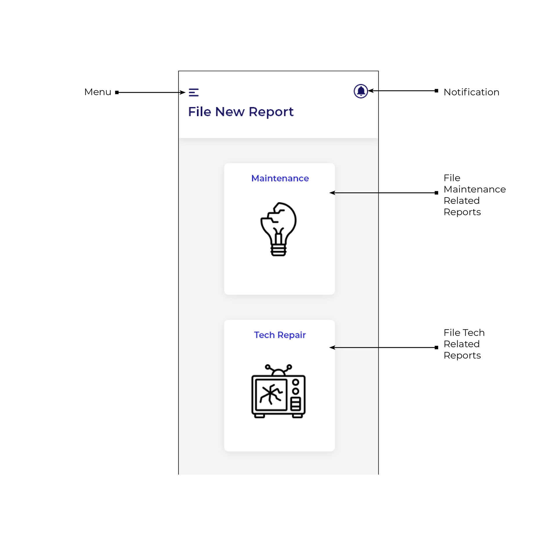
Detailed view of Filing New Reports
User Flow
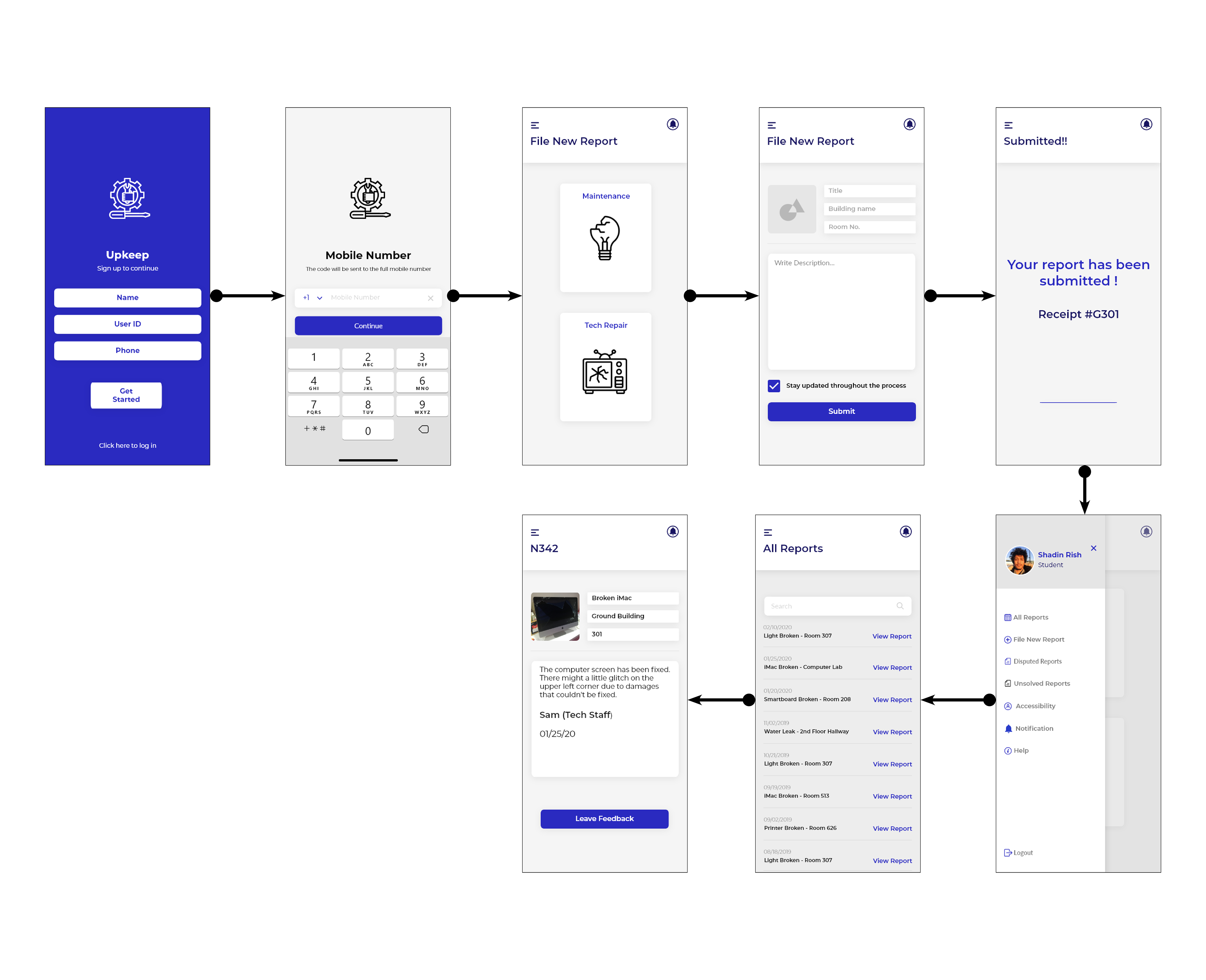
Prototype
Usability Testing
Participants were asked to share their thoughts as they tested the prototype.
Some of the things that they have mentioned were:-
•It would be helpful to have a page assigned for setting control
•Option to customize color for the buttons
•Option to enable face recognition and voice recognition
Summary
The key features of the app include:-
•Clear updates on each step of the process of filing report based on pain points
•A way of staying updated with all of the reports to know whether the user's reports were resolved
•Notifications to alert the users with every update made to their reports
Conclusion
Summary:-
The key features of the app include:-
•Clear explanation of the process of filing report based on pain points
•A way of staying updated with all of the reports to know whether the user's reports were resolved
•Notifications to alert the users with every update made to their reports
Challenges:-
•The biggest challenge I faced was designing a system that would be usable for all users regardless of their age and background. I wanted to design an app that would be each to navigate through for users that are not up to date with the current technology to give access to the elder students and professors at my school.
•Even though I did my research, I felt like my research did not cover each and every various group of people at my school. That made me feel like I was working with a limited amount of information.
Improvements:-
If I was given more time and resources to work with, I would spend more time on research to have a deeper understanding of my target audience and to accommodate their needs. I would also like to spend more time integrating technologies such as Google Translate to translate the texts to users who are not native English speakers.
Credit
Icons:- Flat Icon
Tools:- Adobe XD